We can’t live without our mobile phones these days. They are the necessary gadgets that every person today depends upon to manage almost everything in the day to day life starting from communication to shopping or even banking.
Globally, there are around 4.88 billion smartphone users and its the short answer of question many web owners ask “why is mobile-friendly web design important for Businesses?”.
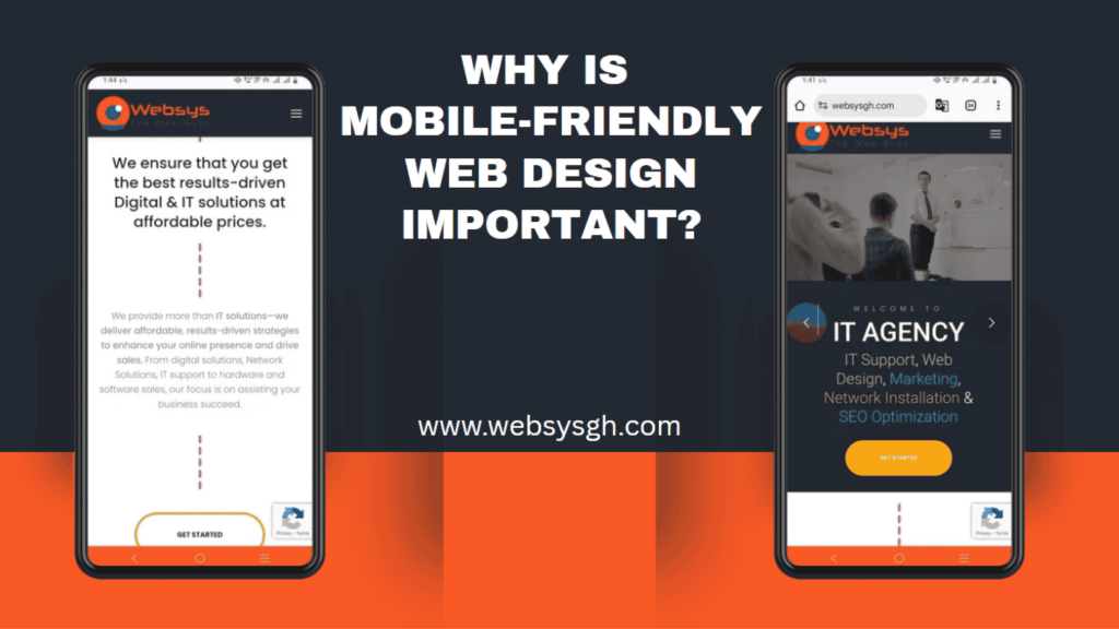
For businesses, adopting responsive web design for a great user experience is critical so that your website can appear well on smartphones. Without good mobile optimisation, companies stand to lose customers who expect to be able to browse easily on the device they use in everyday life. This article explores key reasons for prioritizing mobile-friendly design and how you can check if your site is mobile friendly. Lets start exploring!
What Makes a Website Truly “Mobile-Friendly”?
In simple words, a mobile-optimized website is one that is designed to work the same across all devices including mobile phones and tablets. Instead of creating a website for a desktop and a separate site for phones and tablets, a responsive design adapts to all device screen size with ease, so the visitors won’t feel much difference.
A truly mobile-friendly site includes:
- Responsive web design for all devices.
- Touch-friendly buttons that are easy to tap.
- Clearly visible fonts (so users don’t squint!).
- Faster download speed
- Mobile-friendly browsing experience with clickable, intuitive menus.
Here’s a simple comparison:
| Feature | Mobile-Friendly Website | Traditional Desktop Website |
| Load Speed | Fast | Slow |
| Buttons and Links | Big and touchable | Small and hard to tap |
| Layout | Adjusts to any screen size | Fixed, needs zooming |
Why Does Mobile Friendliness Matter in 2025 and Beyond?
Over 63% of Google traffic globally comes from mobile devices—this trend is even more pronounced here. Users expect websites that load fast and clearly display on smaller screens. Users want websites which load instantly and render well even on smaller screens. Lacking this element results in frustration and sends visitors directly to competitors.
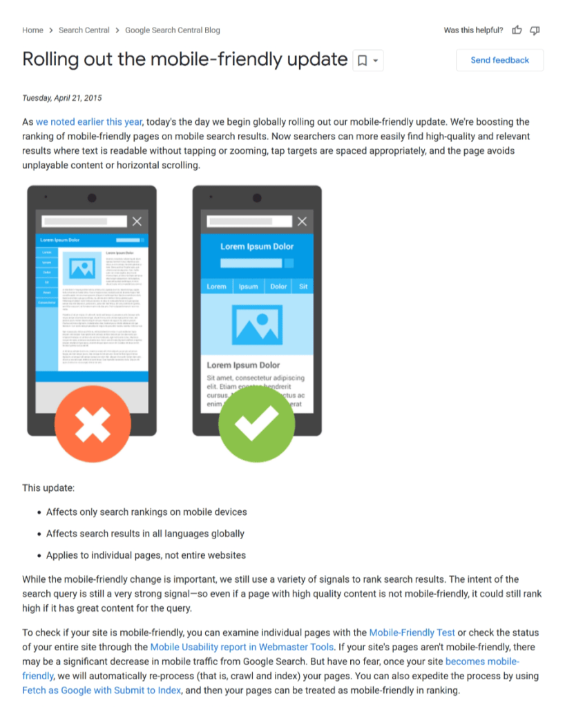
On April 21, 2015, Google rolled out a major algorithm update called “Mobilegeddon” that favours mobile-friendly sites in its search results. This update puts mobile optimisation at the forefront for businesses that wish to uphold a powerful search presence.
Websites that don’t follow Google’s standards for mobile compatibility notice a drastic decrease in rankings, making the need for responsive web design an ever-growing priority. Even after 10 years, referring to this update is enough to highlight why mobile friendliness is important for online success.
1. Enhanced Search Visibility & Mobile SEO
Google rewards sites with better rankings that create a good experience for site visitors on mobile. After the 2015 update, Google made mobile usability an even more critical ranking factor for websites. Mobile-friendly sites get increased visibility in mobile search results.
In other words, mobile optimisation boosts your SEO. Without maintaining a website for mobile phone users, you cannot get much traffic to your site, even if you apply all other SEO strategies very well.
2. Improved User Experience (UX)
The “Great User Experience” (UX) of your site is not an option, but a must! Mobile users can easily be distracted. If your website is slow or difficult to use, the users who were interested in your services or product may bounce, and you’ll lose them as potential clients immediately.
To guarantee a better user experience, here is what you can do:
- Expand text size to make it easier to read.
- Optimise images (compress them) to load more quickly over mobile networks.
- Add clickable buttons/links which are finger-friendly.
- Keep a close eye on your website’s technical health and page speed.
Real-world feedback matters too. Regularly gather user insights on time spent on page and ease of use through surveys or simple feedback forms.
3. Increased Lead Generation
Websites optimised for mobile drive significantly increased lead generation. Customers want instant replies — WhatsApp conversations, speedy phone calls and plain online shopping. A site that isn’t mobile-friendly stands the risk of losing these potential customers.
If your own website doesn’t make it easy to contact you or purchase your products with a smartphone, you are simply missing out on leads/sales. Don’t forget that happy users are paying customers.
4. Competitive Advantage & Brand Trust
A technically sound website will help you maintain credibility. Customers trust brands which allow them to make easy online transactions. A functional, aesthetically pleasant mobile site makes your business look professional and ultimately helps your business differentiate itself from the competition.
When you invest in responsive design, you’re showing that your company is committed to customer satisfaction. By allowing users to find whatever they need without any hassle on your mobile-friendly site, you can gain trust over the long-term.
How Can I Check Whether Your Site Is Mobile-Friendly or Not?
Here are separate tables for each tool to check your website’s mobile-friendliness, with concise step-by-step instructions:
- Google’s Mobile-Friendly Test
| Step | Action |
| 1 | Go to Google’s Mobile-Friendly Test |
| 2 | Enter your website URL |
| 3 | Click “Test URL” |
| 4 | View results showing pass/fail status |
| 5 | Review suggestions for improvement |
Google Chrome’s Lighthouse Insights
| Step | Action |
| 1 | Open your website in Google Chrome |
| 2 | Right-click and select “Inspect” |
| 3 | Go to the “Lighthouse” tab |
| 4 | Choose Mobile under device settings |
| 5 | Click “Generate report” |
| 6 | Review mobile usability and core vitals |
GTMetrix
| Step | Action |
| 1 | Visit GTMetrix |
| 2 | Enter your website URL |
| 3 | Select Test from a mobile device (optional) |
| 4 | Click “Test your site” |
| 5 | View a detailed report on page speed and mobile responsiveness |
Simple Checklist:
- Does your site load quickly?
- Is the content easy to read without zooming?
- Are navigation buttons clear and finger-friendly?
- Does the site adapt smoothly to different devices?
If the answer to any question above is “no,” reach out to a qualified web developer for a complementary assessment. Let professionals do the heavy lifting and make your website effective for all users.
Final Lines:
Having a mobile-friendly website is not just fashionable, it’s a necessity. As an increasingly mobile-dependent population, businesses need to make certain their websites are quick to load, navigable and easy to use. Begin your journey today, invest in your online presence, grow your brand and capture more customers with a mobile-ready site.
Invest now and stay ahead. Your business deserves a website that can keep up with the current, mobile-driven demands.
WebSys Technology offers expert solutions to optimise, design, and grow your online presence.
Want a website that is optimised for mobile?